I don’t think anyone is truly prepared for fatherhood.
We probably say we are and act like there’s a course we aced, ready to blow the world away with our parental dexterity.
But when the nurse handed over our first child, all that confidence made a bee-line for the exit.
For one thing, despite the reassurance from the support system around me, I was pretty sure I hadn’t mastered the art of carrying—no, holding—a newborn.
That came with practice. Three kids in, and I’m still not sure I can claim a certificate in this.
Of the many things I had to keep tabs on, none filled me with greater anxiety than the vaccine schedule.
Amid the giggles and plaudits, the dread of what would happen if I skipped immunization day hung over me.
So that got me thinking: there has to be a better way to remember and keep track of this stuff.
The little card they hand you with the dates is useful, sure, but it feels a bit dated.
We’re increasingly trying to declutter our pockets.
What are the chances you’ll think, “My pockets feel so much lighter now that I’ve said goodbye to the 34 business cards from that thing I went to.
What they need is yet another thick piece of paper”?
This is how the idea for “Immunise” was born.
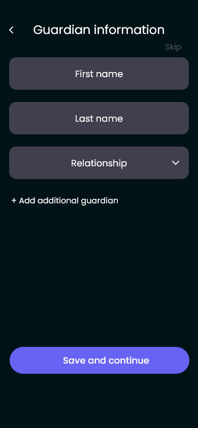
I figured there was no way I was the only parent, guardian, minder, or well-wisher who needed some help, so I decided to take a stab at developing a tracker for new parents.
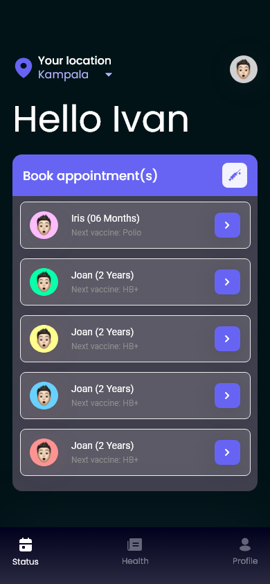
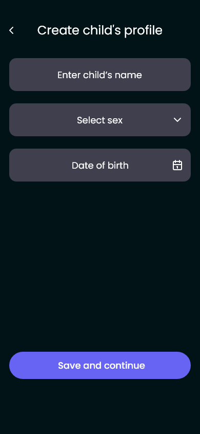
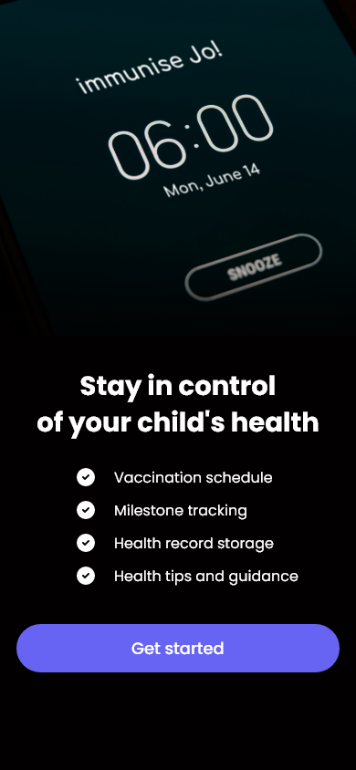
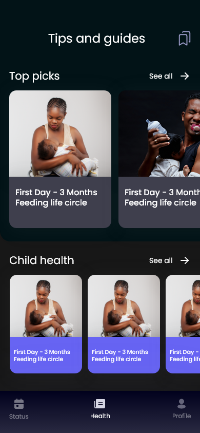
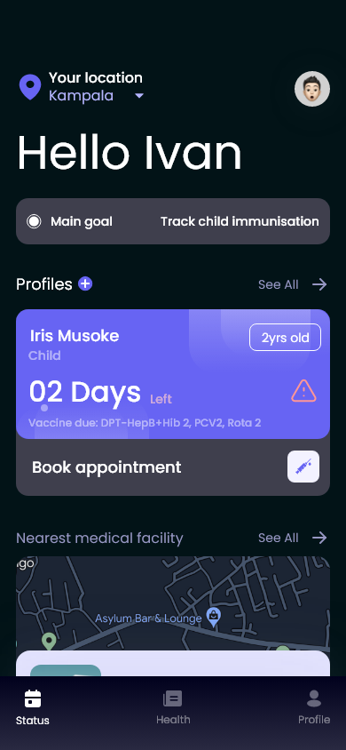
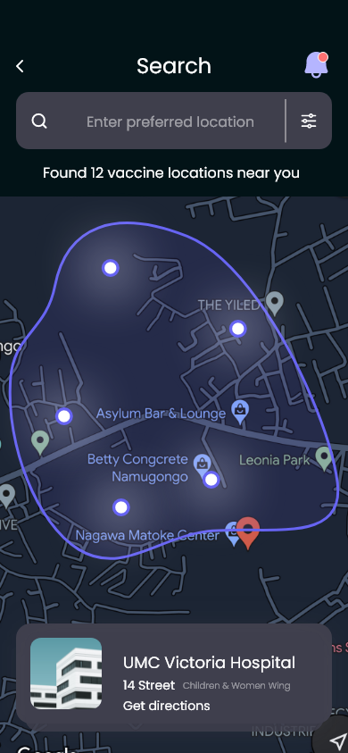
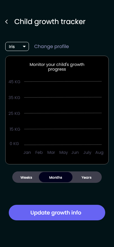
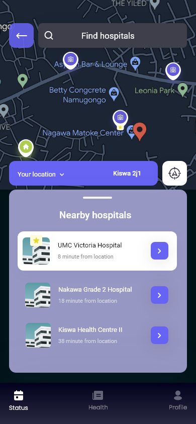
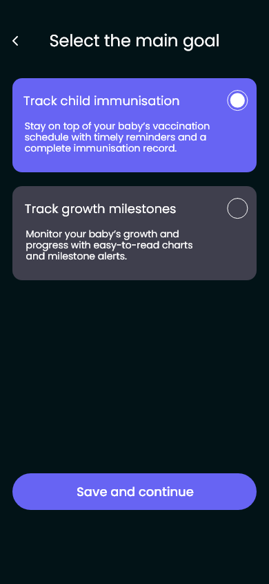
It was meant to remind them of when vaccines were due, which ones were pending, where they could get them, and also track the progress their little ones were making.
As I went along, I became more ambitious.
What I didn’t realize at the time was that I was dipping my toes into the world of UX.
Was I any good at it? Nah. Not likely. But we learn by doing.
The idea kinda went to sleep for a bit when work took up more of my time,
but it was at work that also met a UX designer who knew a thing or two about how to spruce this up.
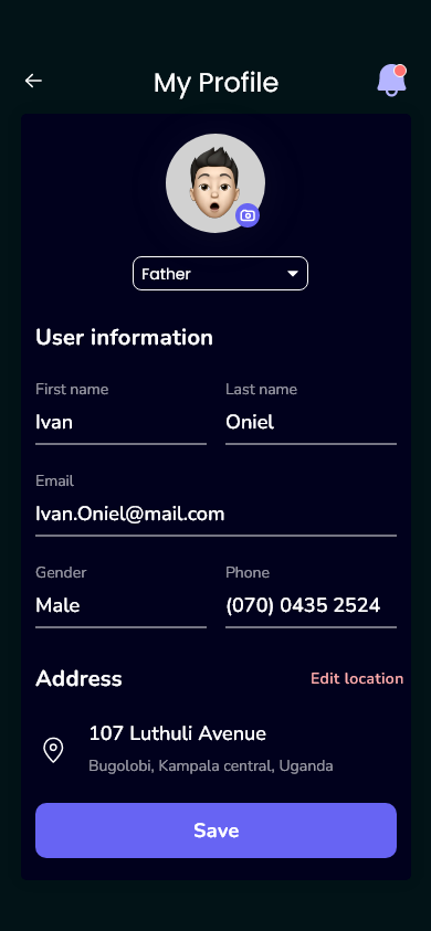
Thus the rebirth of Immunise
Also, it allowed me to rework the copy – I’d interacted with more apps and some things were not gelling with me….
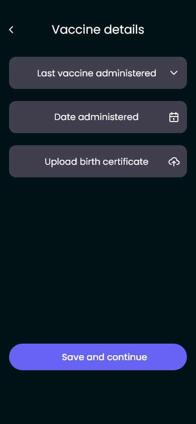
I know, the order is all wrong. If we finally get this thing off the ground, trust me, it will flow better. The visuals were a great improvement, right? (Ignoring the misplaced icon)
