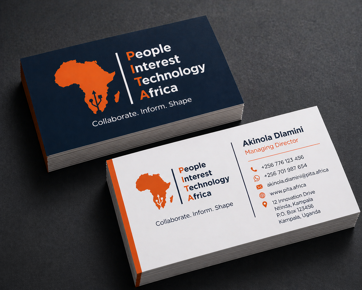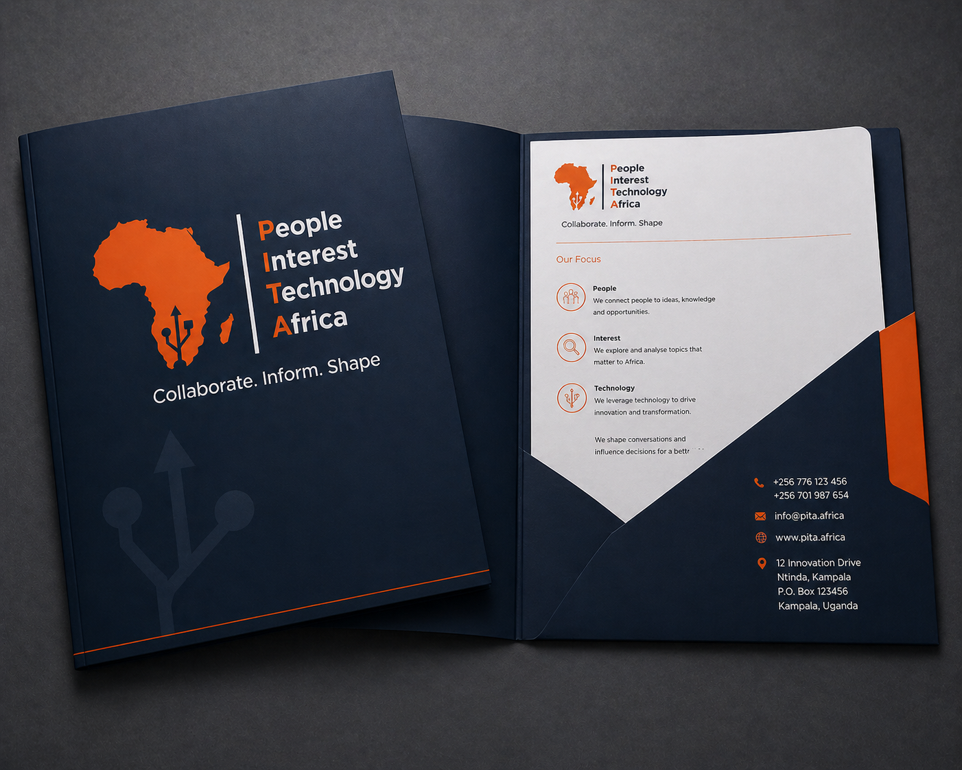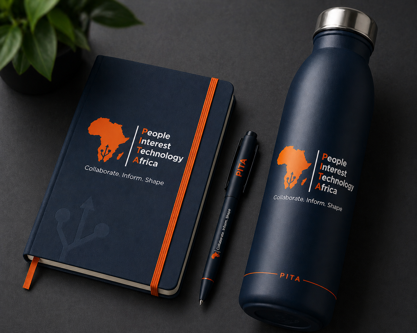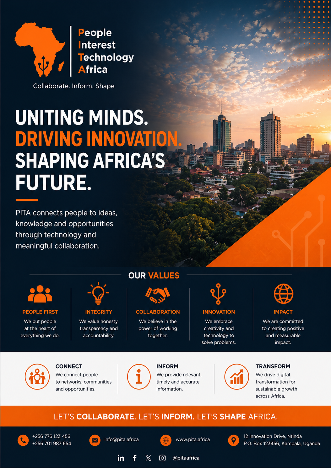
The identity starts with a clear anchor, the Africa silhouette, which sets the geographic focus at a glance, then layers in a subtle tech signal within it to point to connectivity and progress.
A simple vertical rule creates structure and leads the eye into the name, where “People, Interest, Technology, Africa” is stacked with intent.
The orange initials form “PITA,” giving the brand a built-in mnemonic, while the rest of the text stays neutral to keep it readable at scale.
The dark blue base carries trust, the orange adds focus, and white keeps everything crisp. The tagline sits quietly below as a set of actions, short and direct.
The result is a system where each part has a role, and together they communicate place, purpose, and function without excess.
![]()
Branding