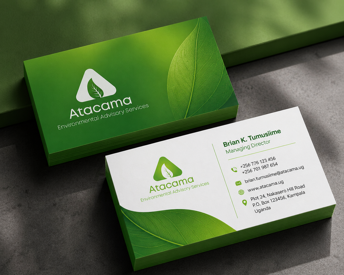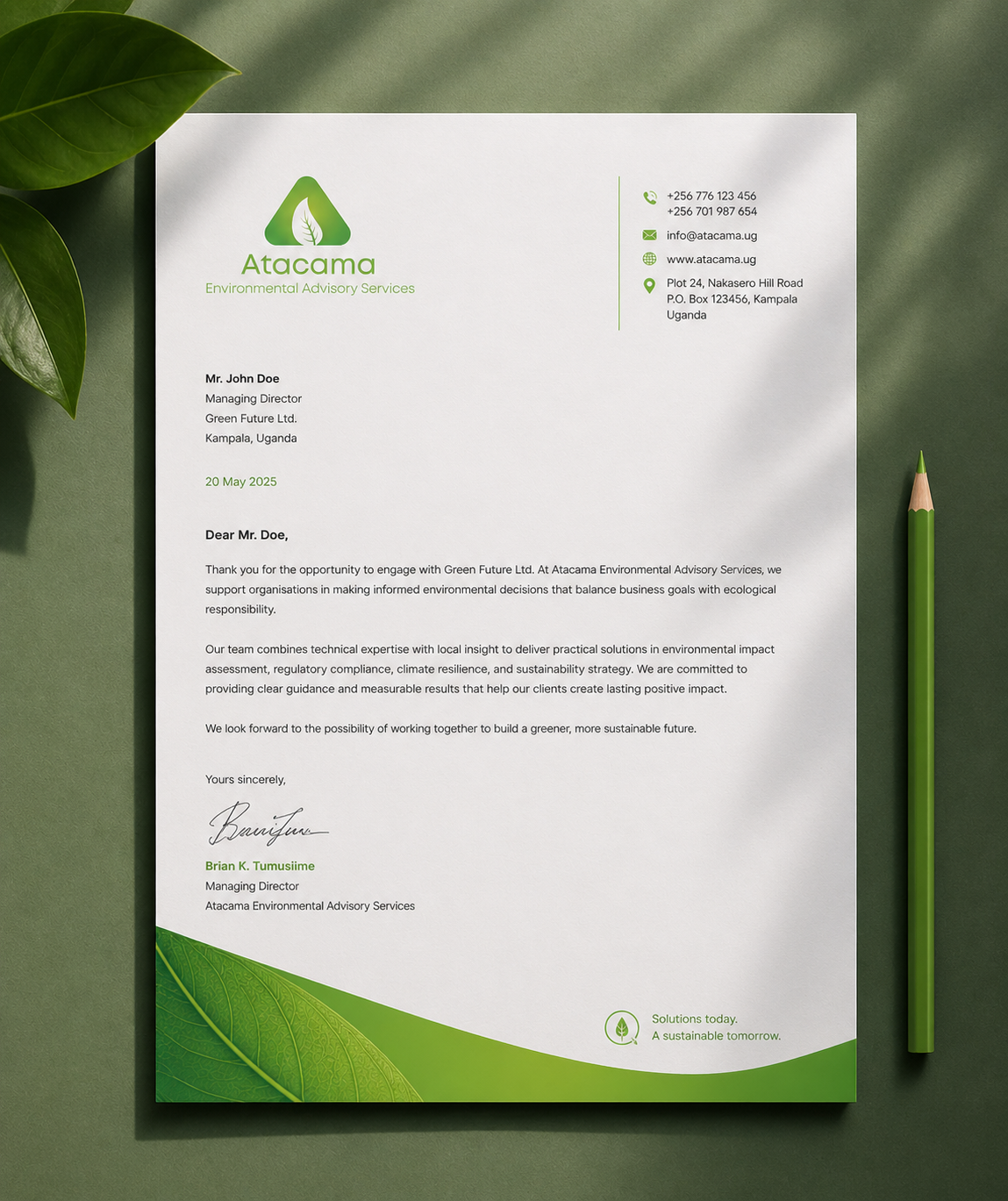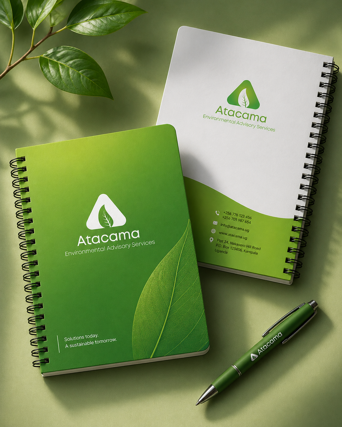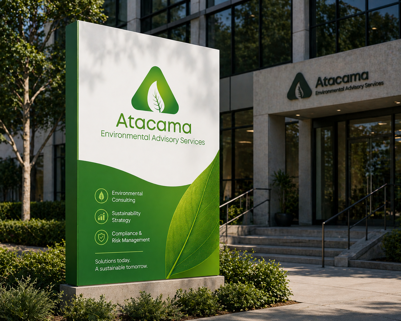
The Atacama mark keeps the idea tight and readable. The triangular form works as a stable frame, which suits an advisory role built on structure and guidance. Inside it, the leaf carries the message without clutter. It signals environment, growth, and stewardship in one move.
The cut-out style gives it a sense of lightness, so the mark does not feel heavy or institutional. The gradient green shifts from fresh to deeper tones, which hints at scale, from local ecosystems to broader impact. The wordmark stays simple and open, with soft curves that feel accessible.
Spacing is generous, so the name reads clearly across formats. The descriptor line does a clear job of positioning the service, no guesswork. Overall, the identity works because it keeps form, meaning, and tone aligned, practical, calm, and easy to apply across real-world touchpoints.
![]()