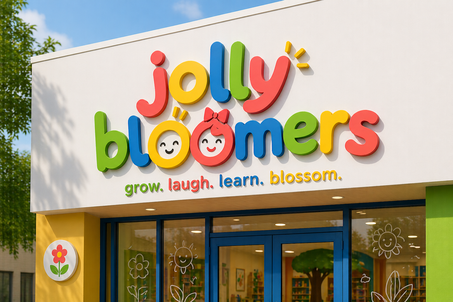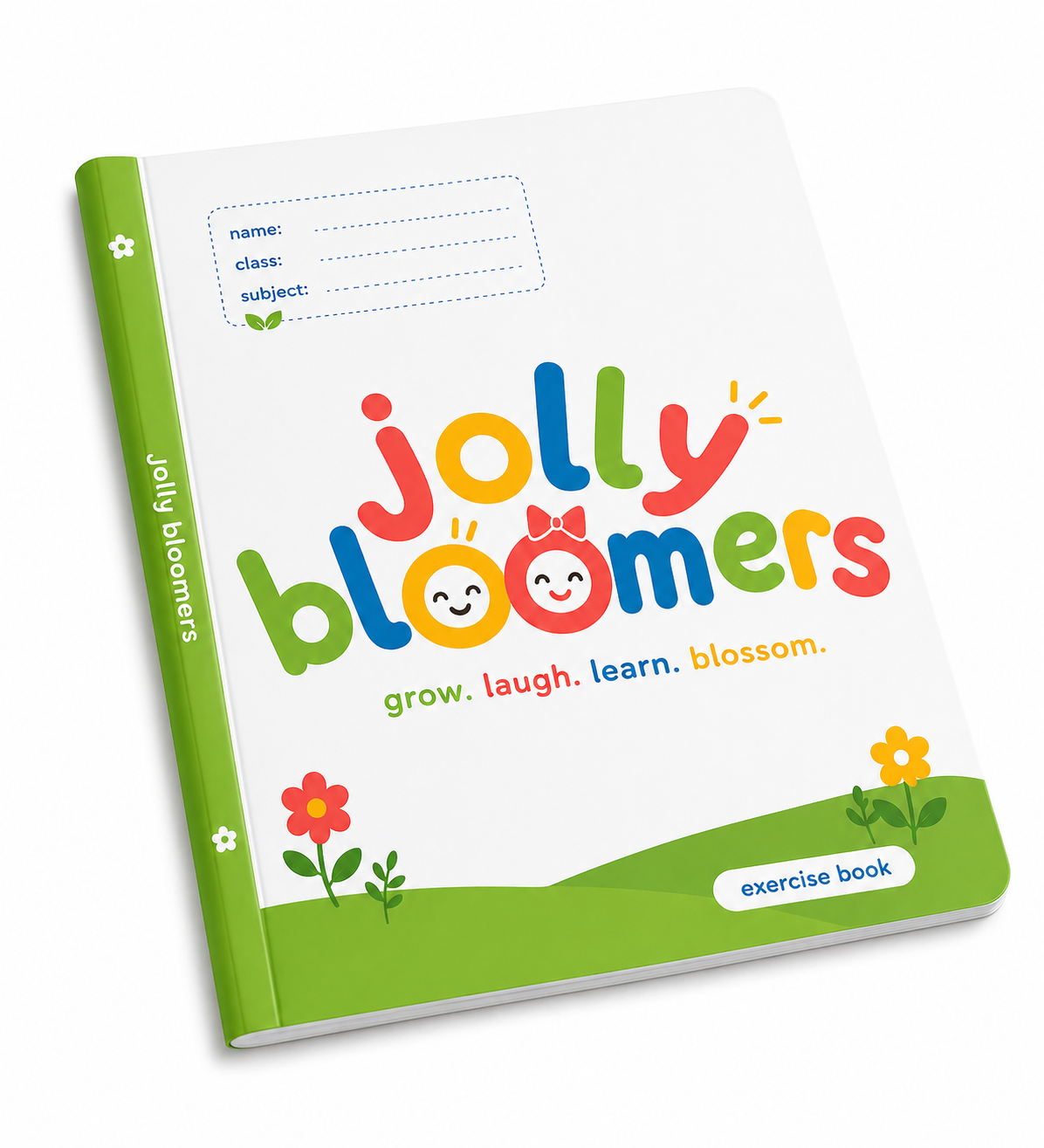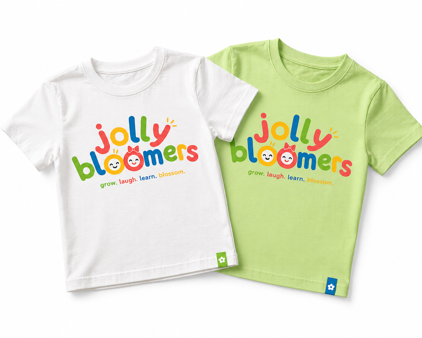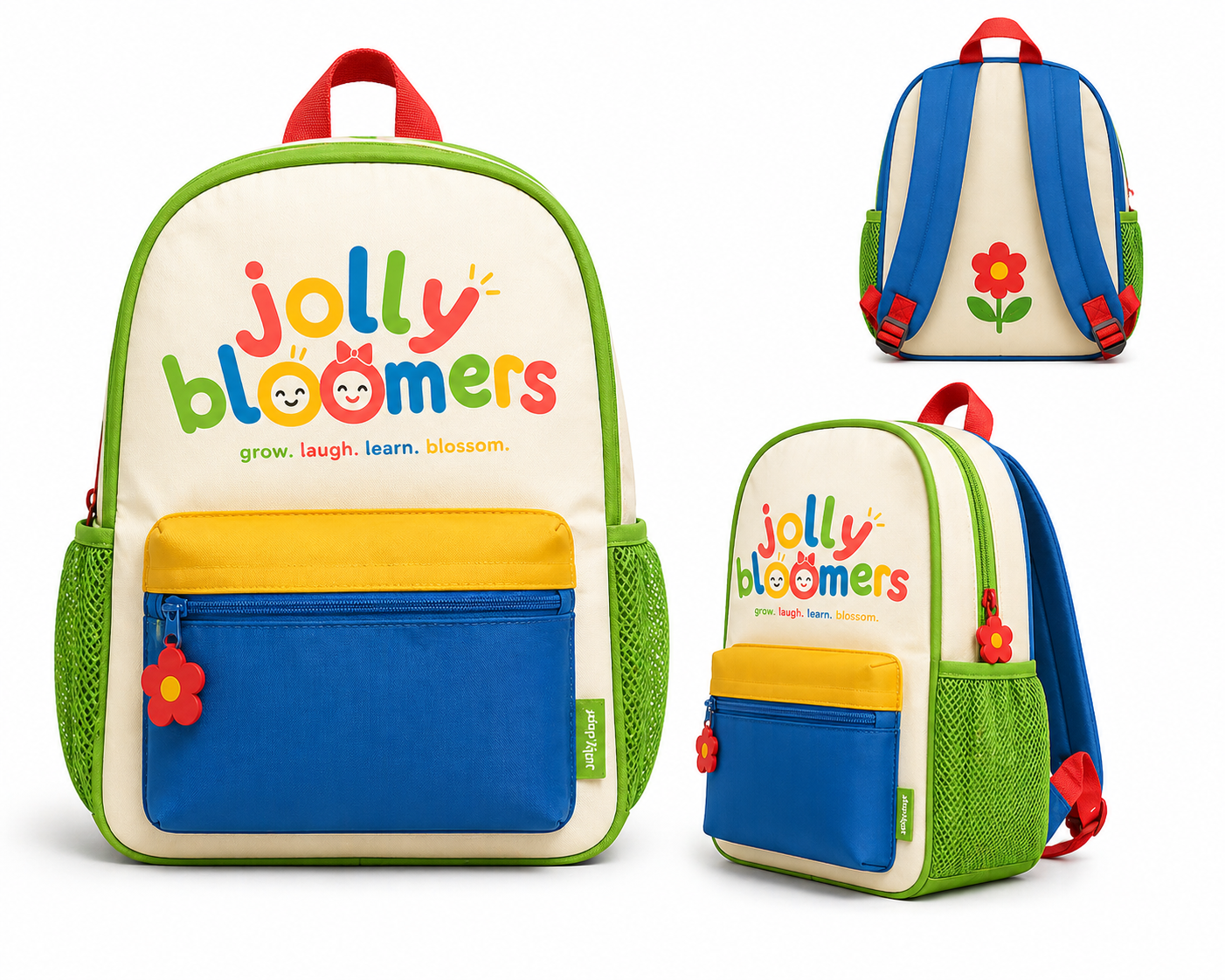
I took a step back and focused on how this should feel. Kids don’t line up neatly, they lean, overlap, and play, so I built that into the letters themselves. I kept everything in lowercase to make it feel open and approachable, then let the wordmark carry the personality instead of adding extra elements. The two “o”s became the only character cue, stripped down to simple faces so they read instantly without clutter. I limited the color palette to keep it lively but controlled, and removed all effects so it works cleanly across signage, print, and digital.
The result feels easy and human, something kids respond to without overthinking it.
Previously
Logo Uplift![]() Branding
Branding