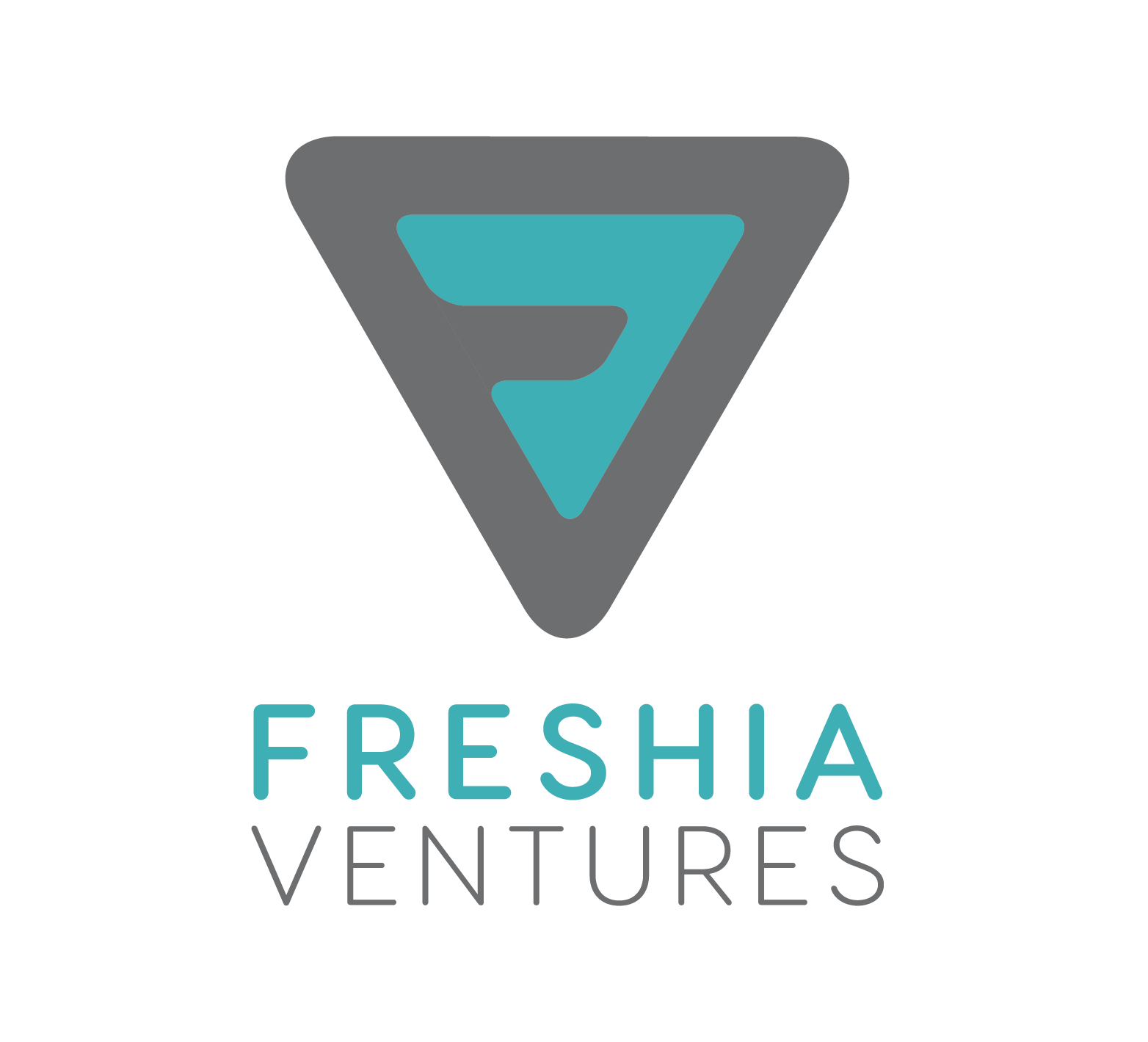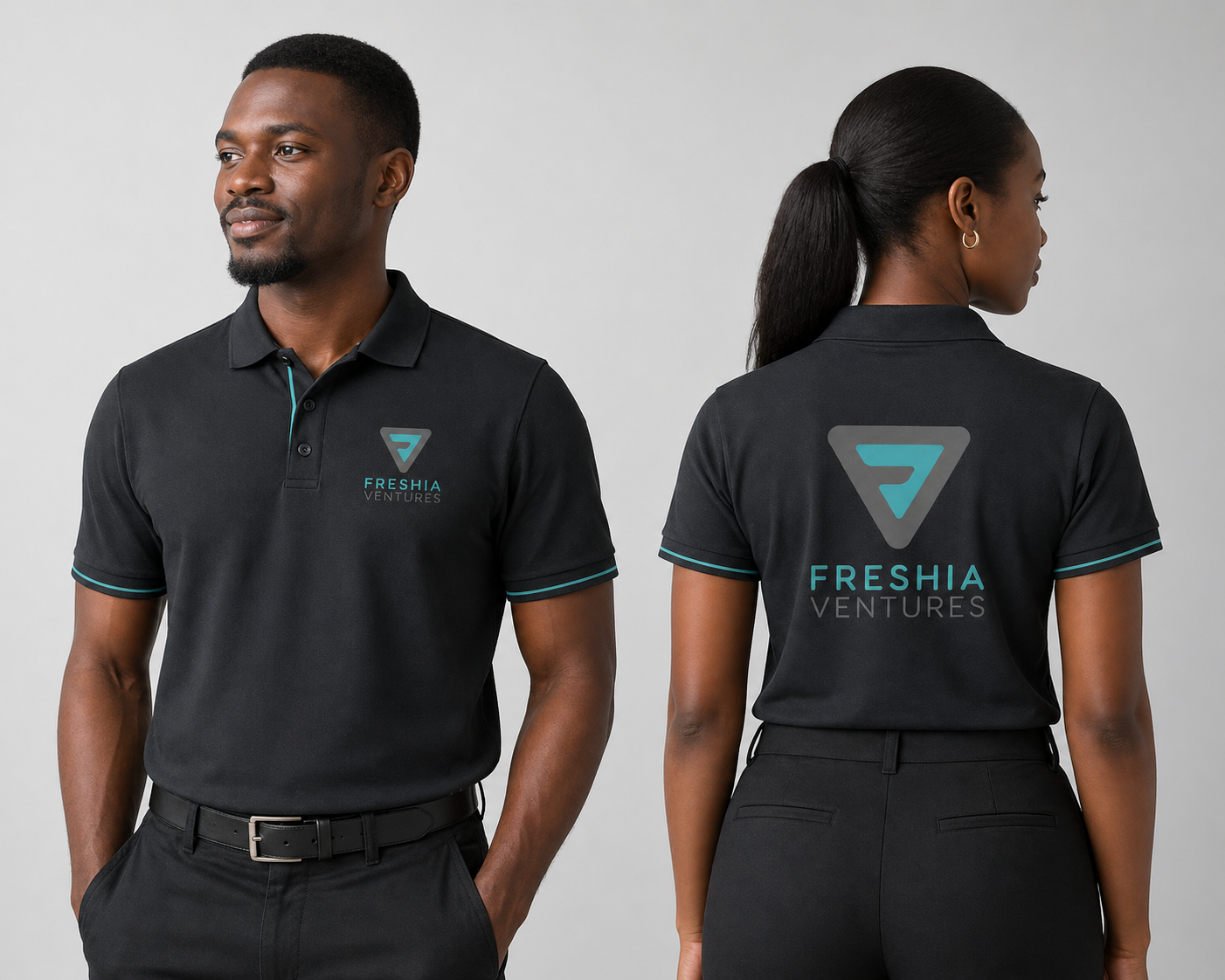
The Freshia Ventures logo centers on a forward-facing triangular mark that embeds a subtle “F” within a continuous path, signaling progress and direction. The shape balances motion and structure, reflecting how ventures grow within a clear framework. A teal accent draws focus and cues growth, while the grey base grounds the mark. The wordmark supports this hierarchy, with “FRESHIA” leading and “VENTURES” set lighter for clarity. The result is a compact identity that reads quickly, scales cleanly, and holds up across applications.
Primary Logo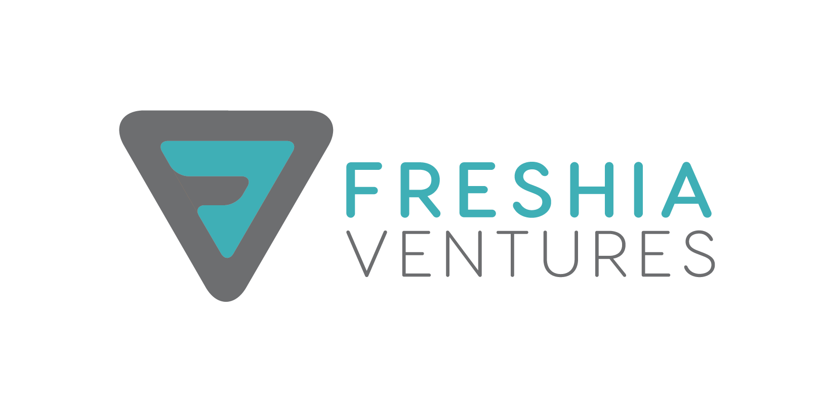 Secondary Logo (Stacked)