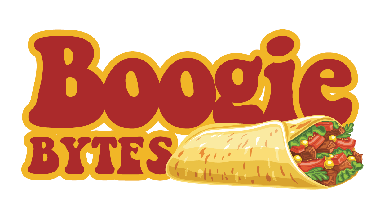
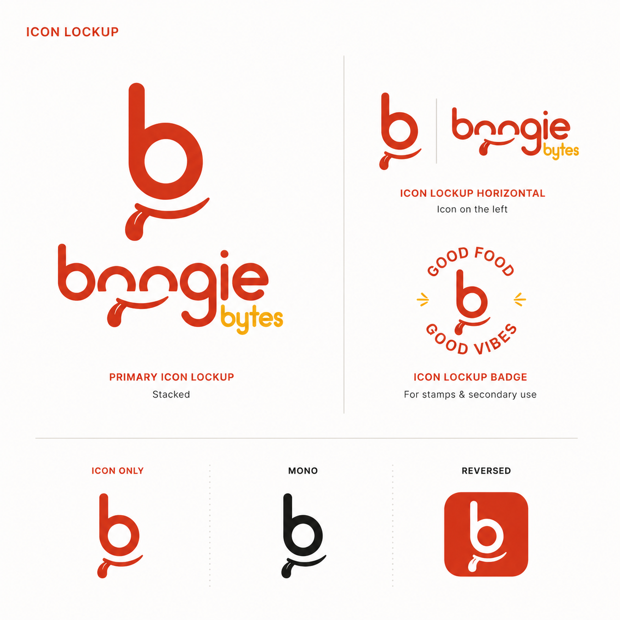
The Boogie Bytes identity follows the same instinct as the name. It steps away from convention. The spelling shifts “bites” to “bytes,” and the design mirrors that choice with a loose, expressive wordmark. The letterforms feel hand-drawn and slightly irregular, giving the brand personality and a sense of fun. The underline reads as a smile, reinforcing enjoyment and ease. Color keeps it warm and appetising, with the secondary word lifted in yellow to keep the hierarchy clear. The result is a brand that owns its difference and turns it into something memorable.
Logo![]() Flyer
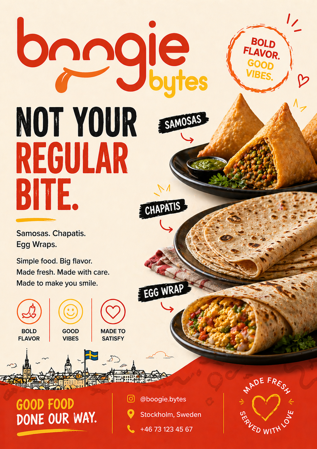
Flyer
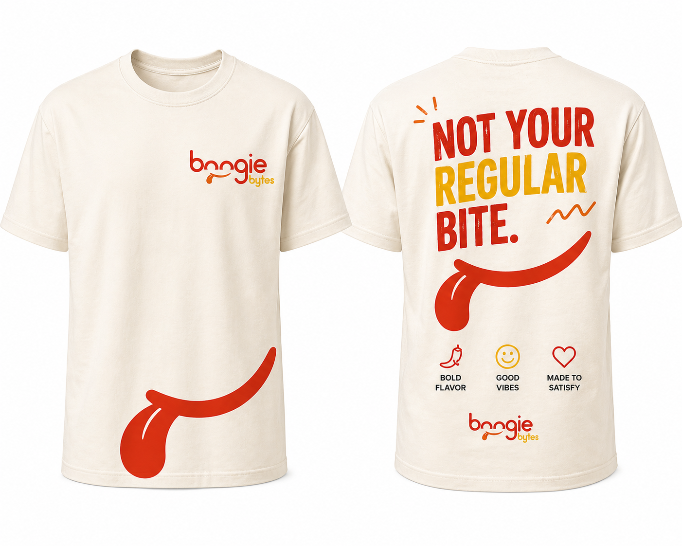
T-shirts
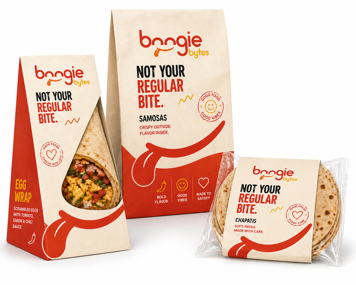
Packaging
Extensions
The one that got away