The Casa Residences logo builds on a simple, architectural idea.
The mark abstracts a house form into a clean, upward shape, suggesting shelter, structure, and growth without relying on literal detail.
The inner lines echo layers or rooms, hinting at depth and considered design.
The wordmark stays restrained, with “casa” carrying presence and “RESIDENCES” set lighter and spaced out for clarity.
The dark palette keeps it grounded and versatile. The result is a calm, modern identity that reads clearly across signage, print, and digital.
Primary Logo![]()
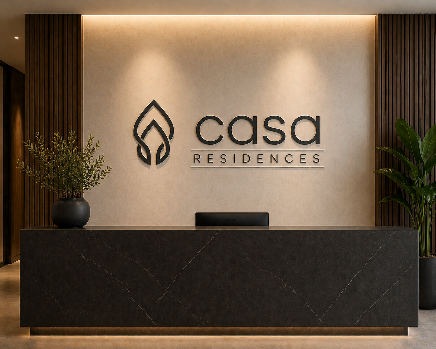
Secondary Logo (stacked)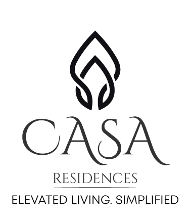 Reception Mock-up
Uniforms
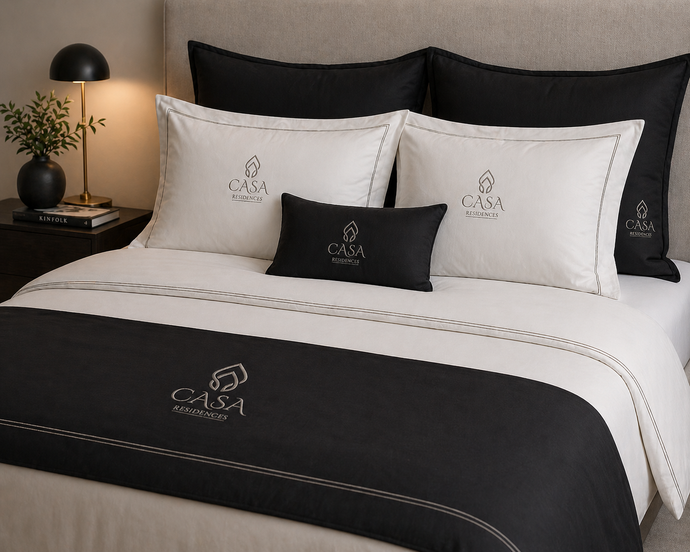
Bed Linen
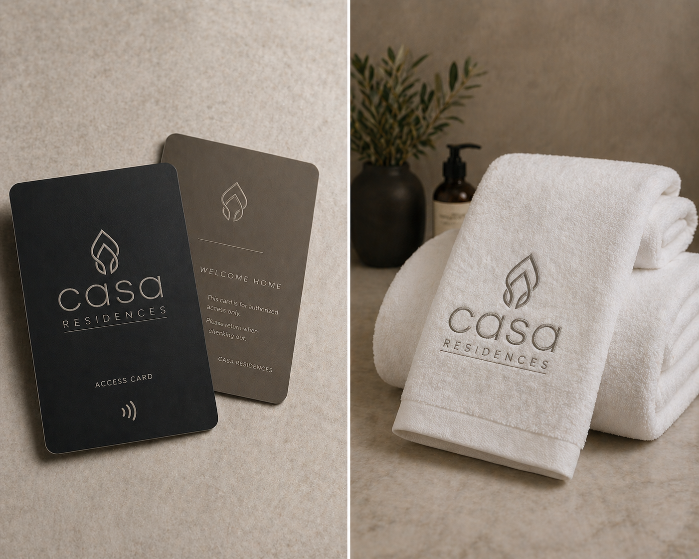
Access Cards and Towels