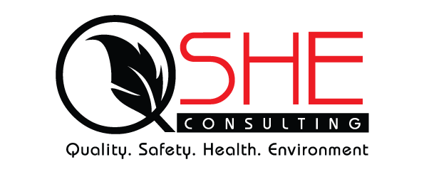
The QSHE Consulting logo is built around four core pillars. The circular mark forms a subtle “Q,” anchoring the identity in quality, while the leaf inside signals health, safety, and environment in one clean gesture. The wordmark drives clarity. “SHE” in red stands out to signal urgency and accountability, while the rest of the name sits in a darker tone to keep it grounded. The supporting line spells out the scope, so there is no guesswork. The result is a direct, structured identity that aligns with compliance, reporting, and corporate environments.
Logo
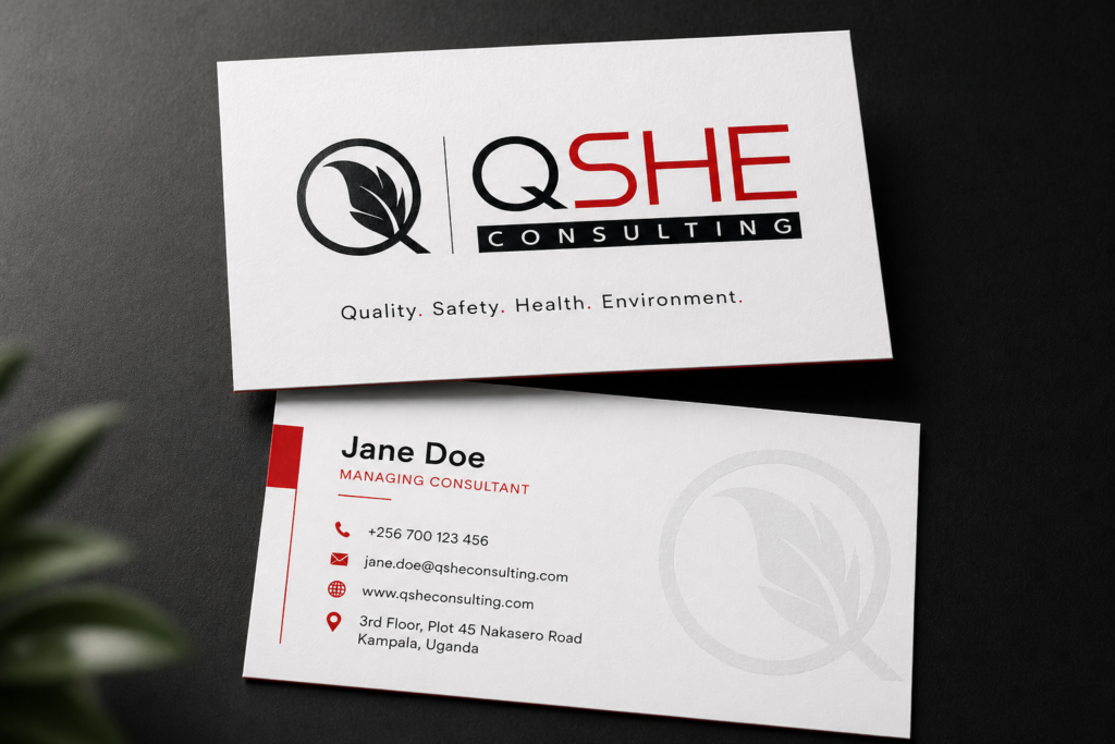
 Business Cards
PowerPoint presentation mock-ups
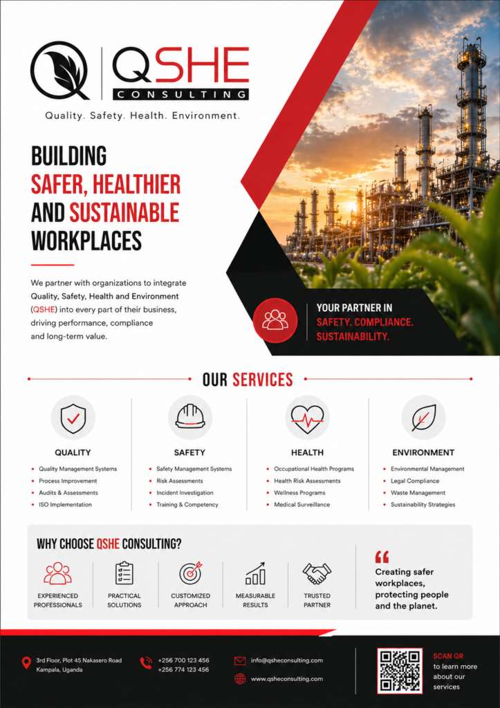
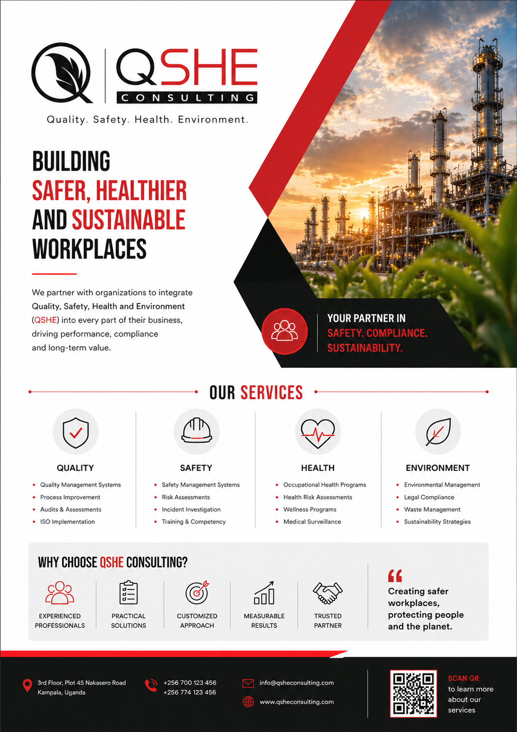
Flyer