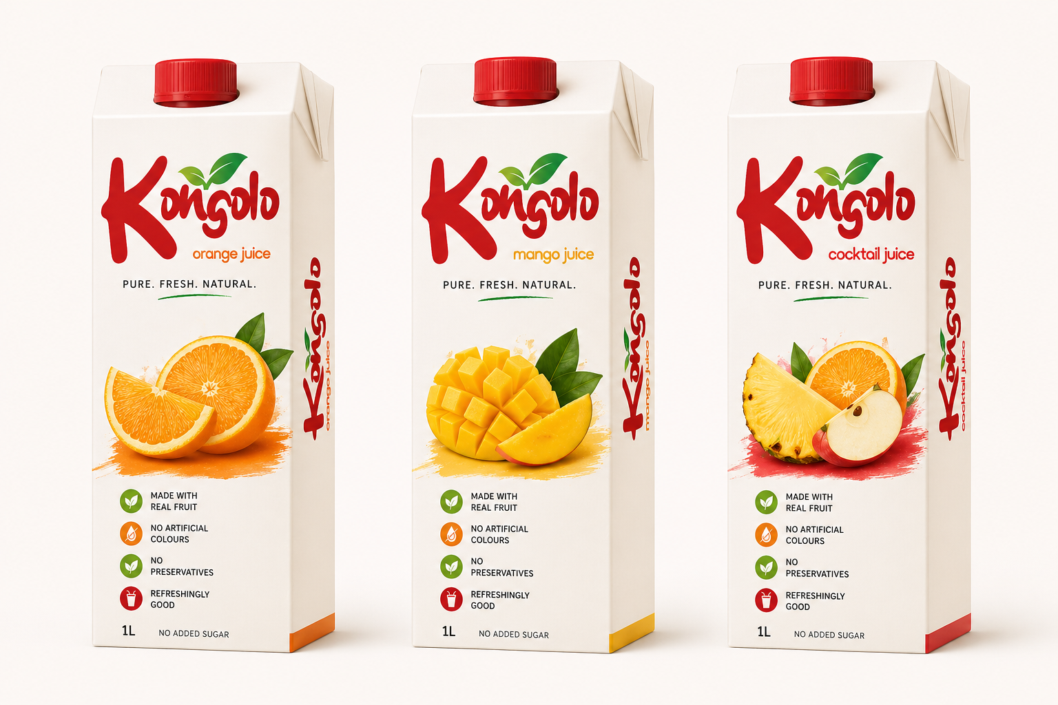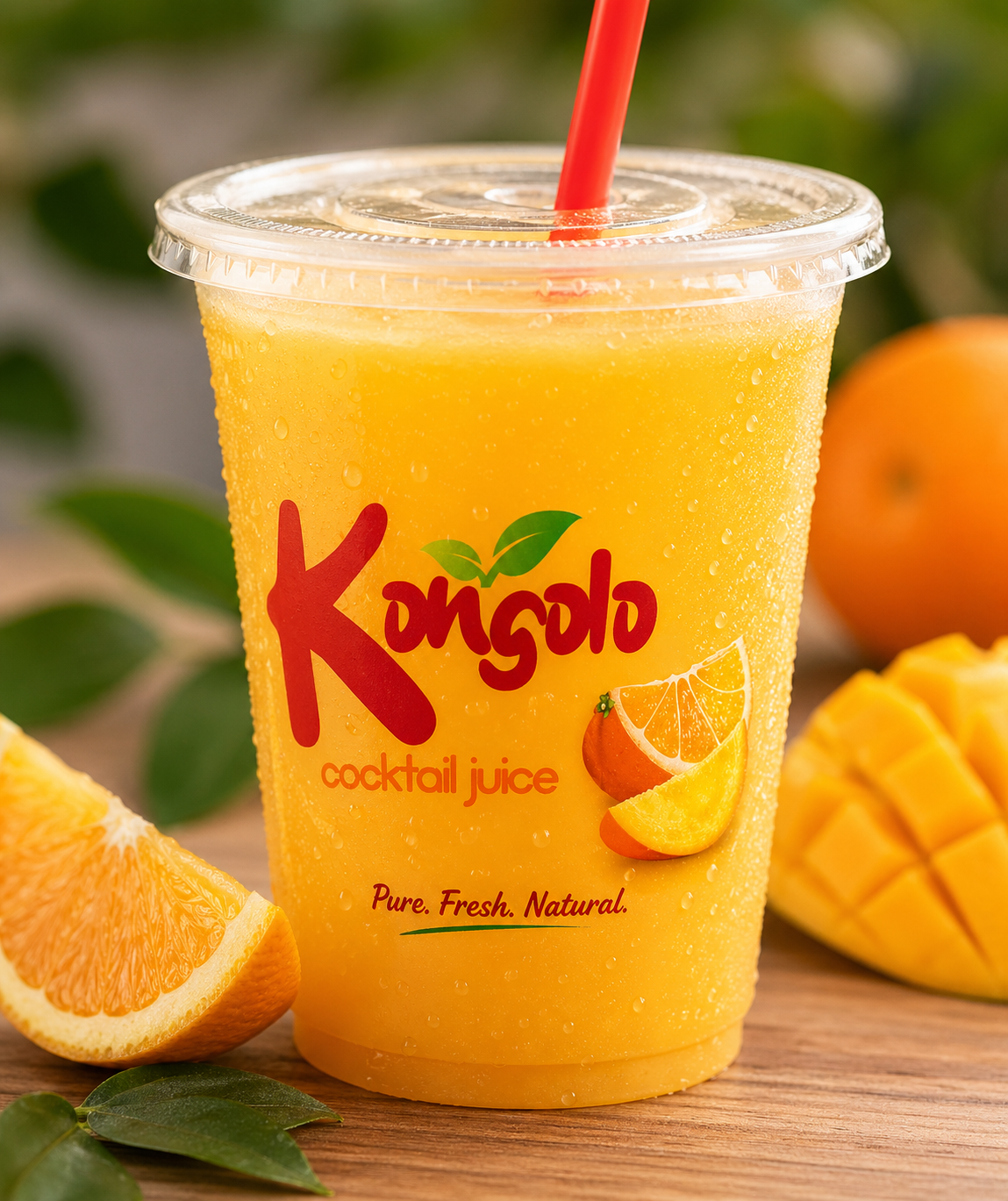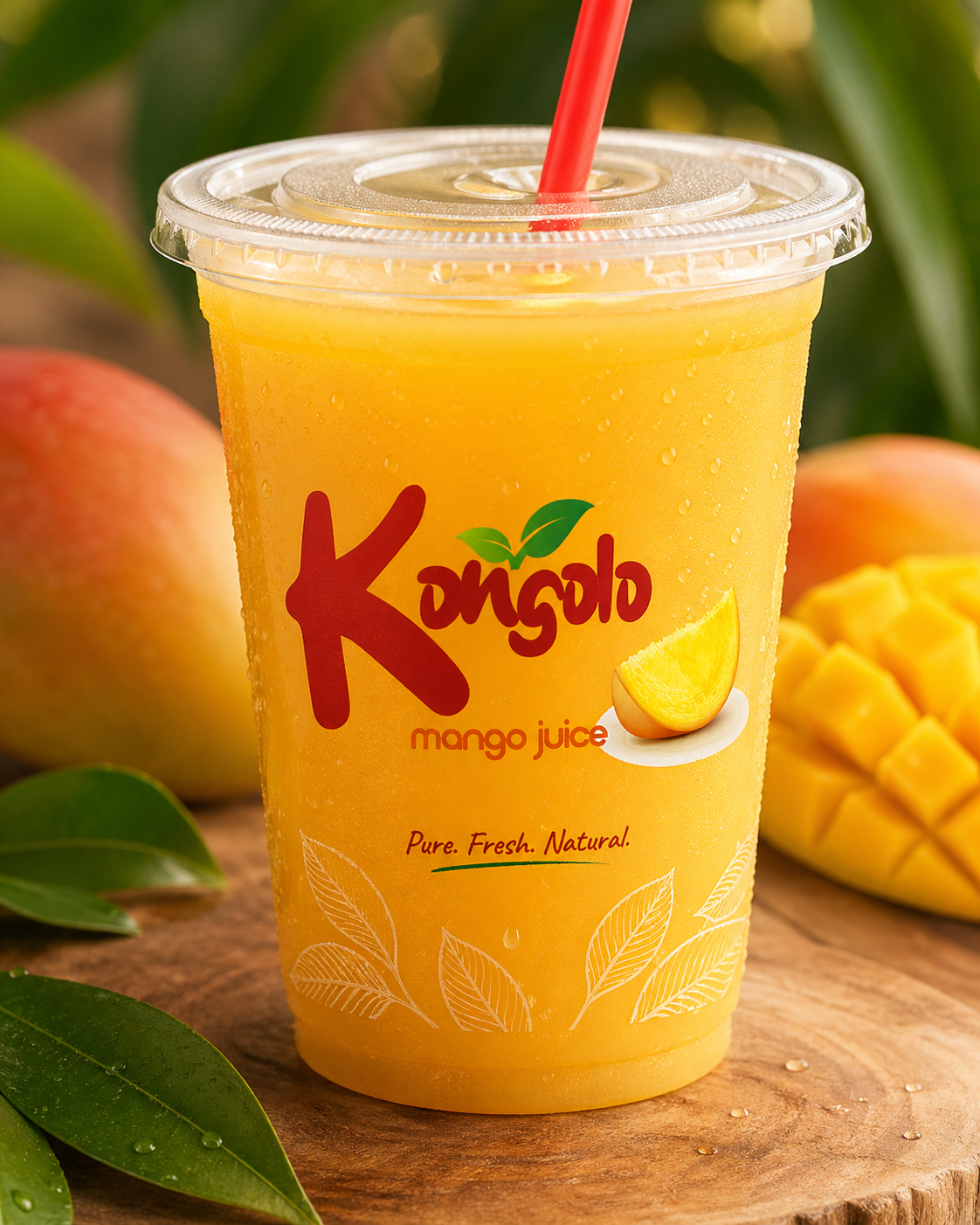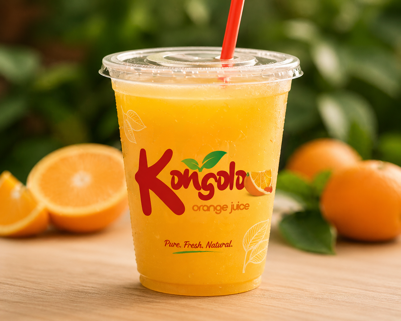
The Kongolo identity leans into energy and immediacy. The handwritten wordmark feels quick and expressive, like something made fresh and served on the spot.
The oversized “K” anchors the brand and makes it easy to spot at a distance. The leaf detail introduces a natural cue, tying the product to fruit and freshness.
Color does most of the work. Red grabs attention, green signals produce, and the fruit visuals remove any guesswork about flavor.
The sub-lines stay simple and consistent, letting each variant switch out fruit while holding the same structure.
The result is bold, easy to read, and built for fast recognition across packs and signage.
![]()
![]()
![]()